
Case Study: Building a Luxurious Wellness Tea Brand from a Single Letter
Our client came to us with a clear vision:
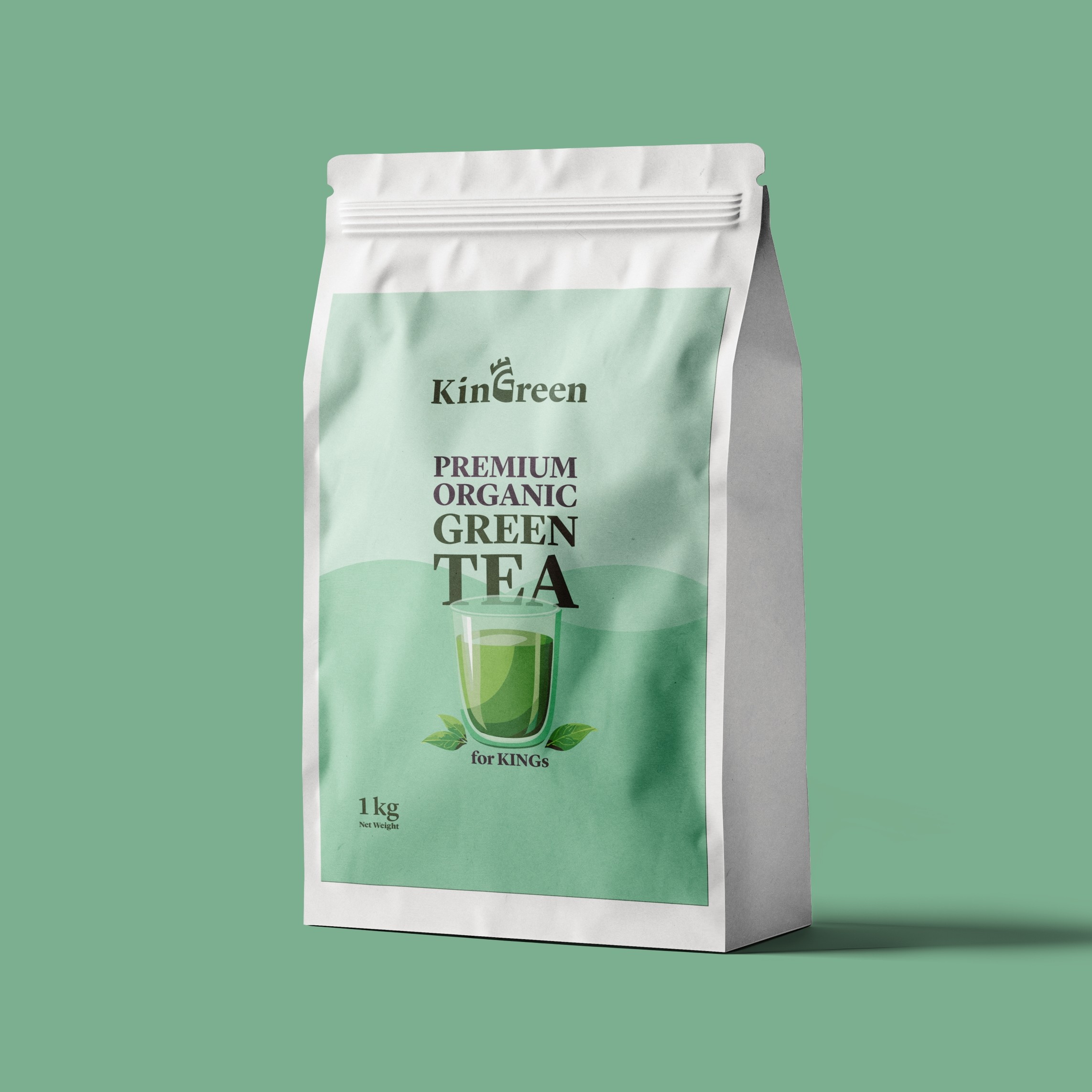
Create a premium green tea brand that feels luxurious, healthy, and rooted in authenticity.
Our approach:
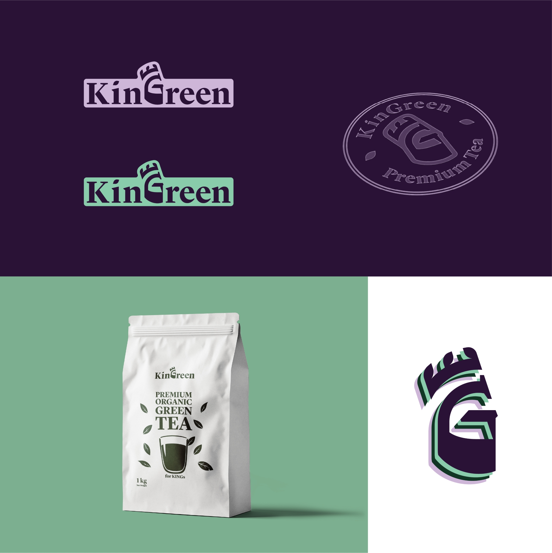
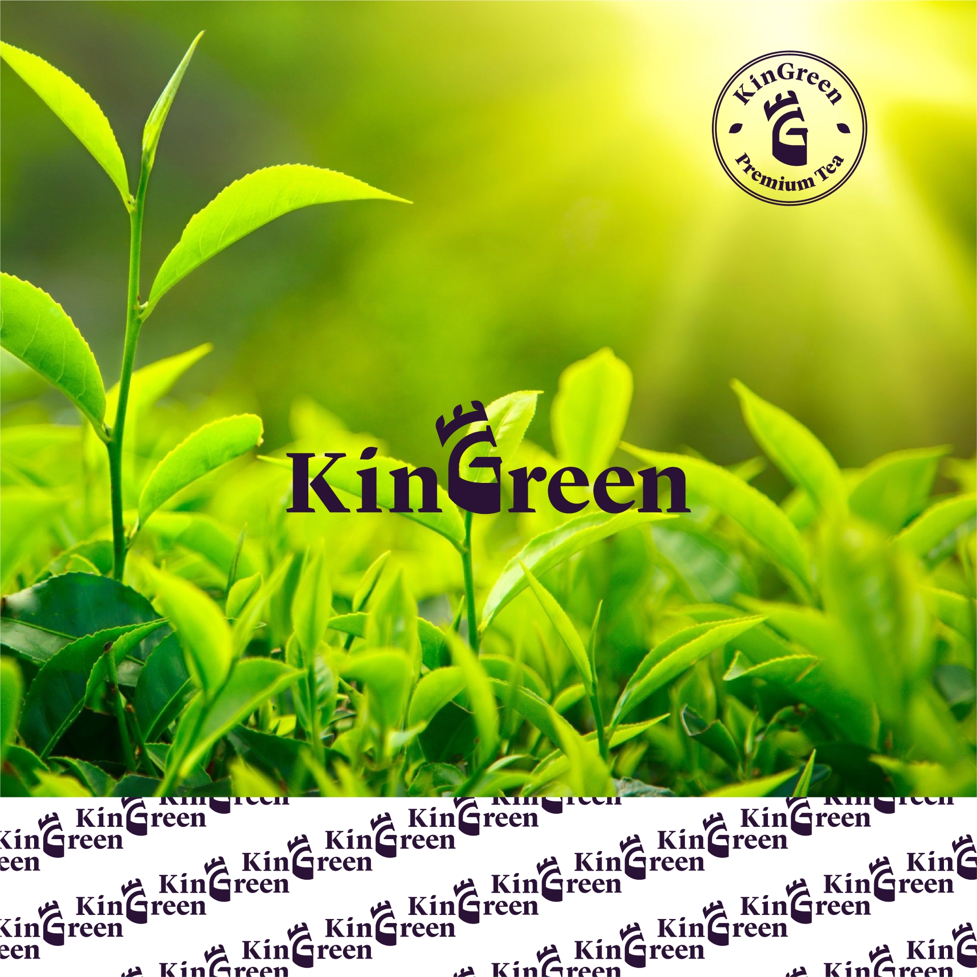
We crafted the name KinGreen — a strategic fusion of “King” and “Green” — to express both heritage and purity.
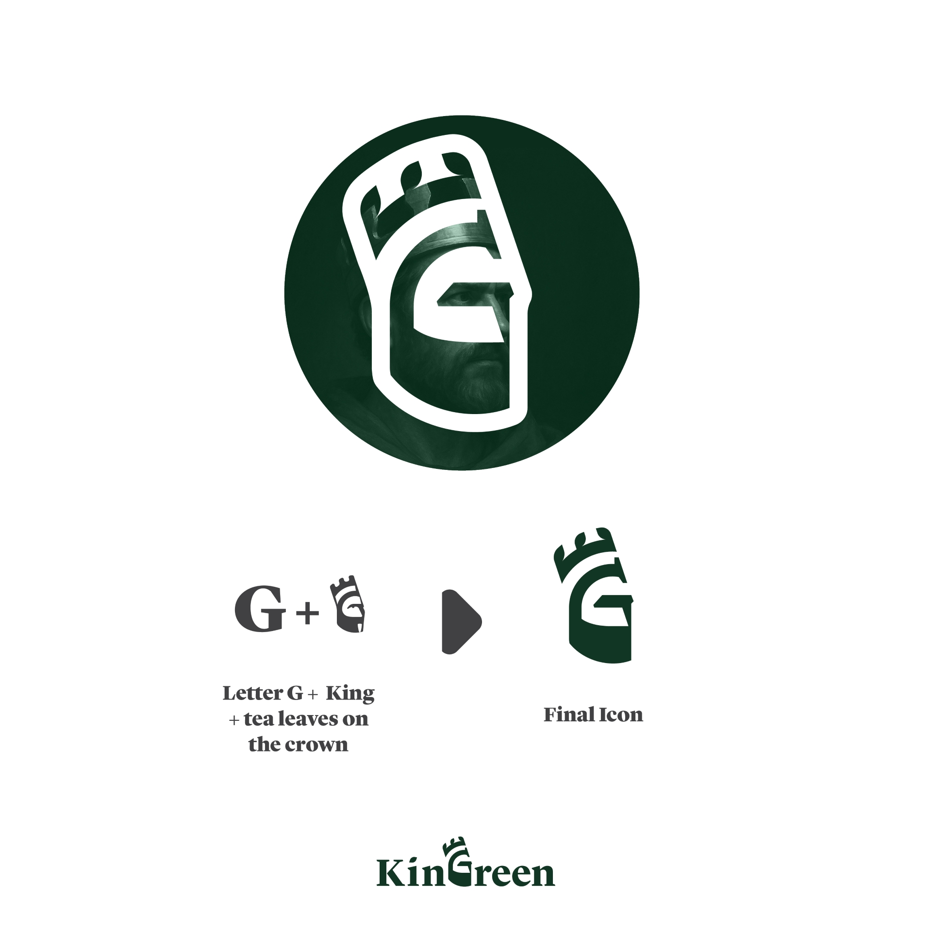
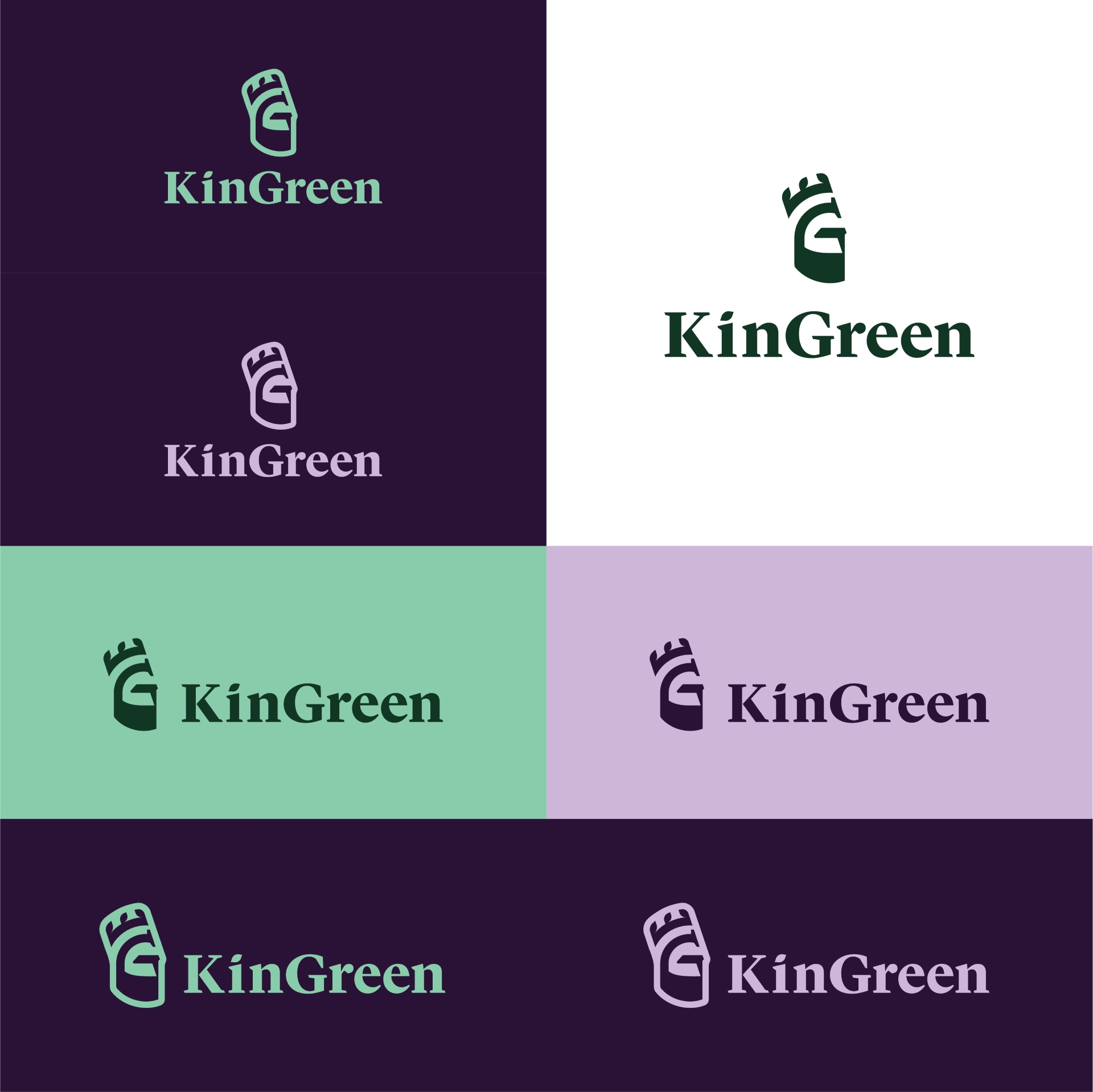
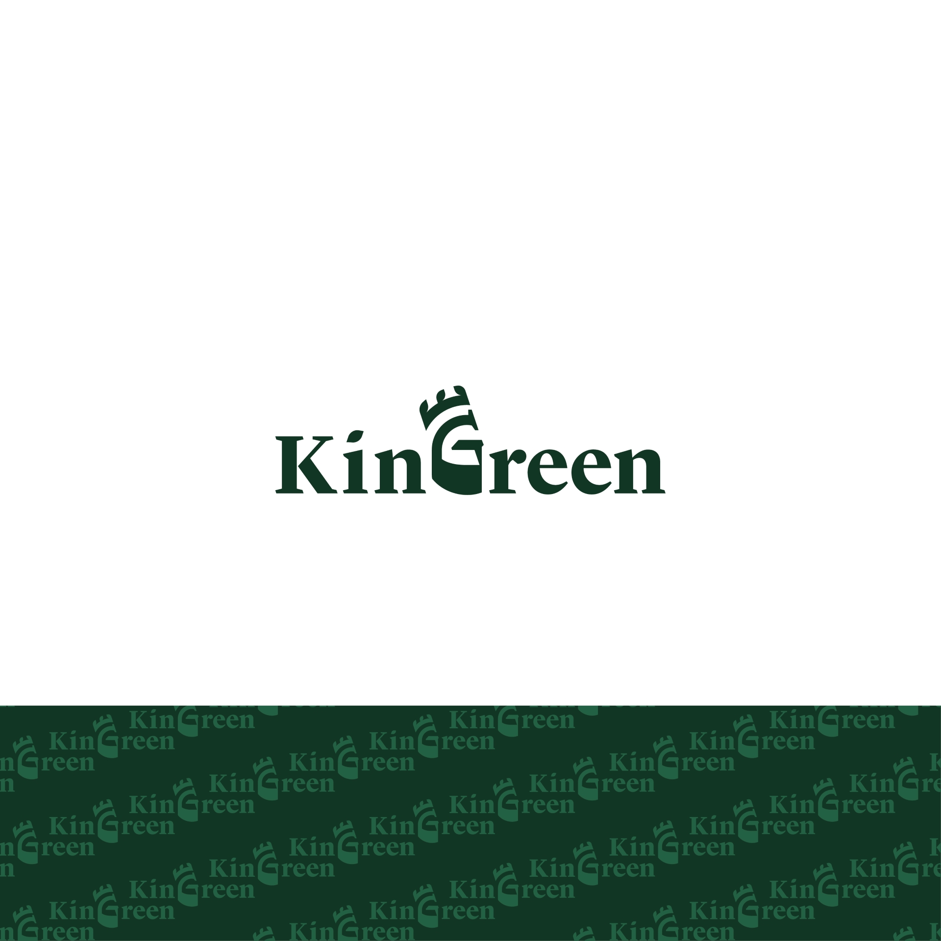
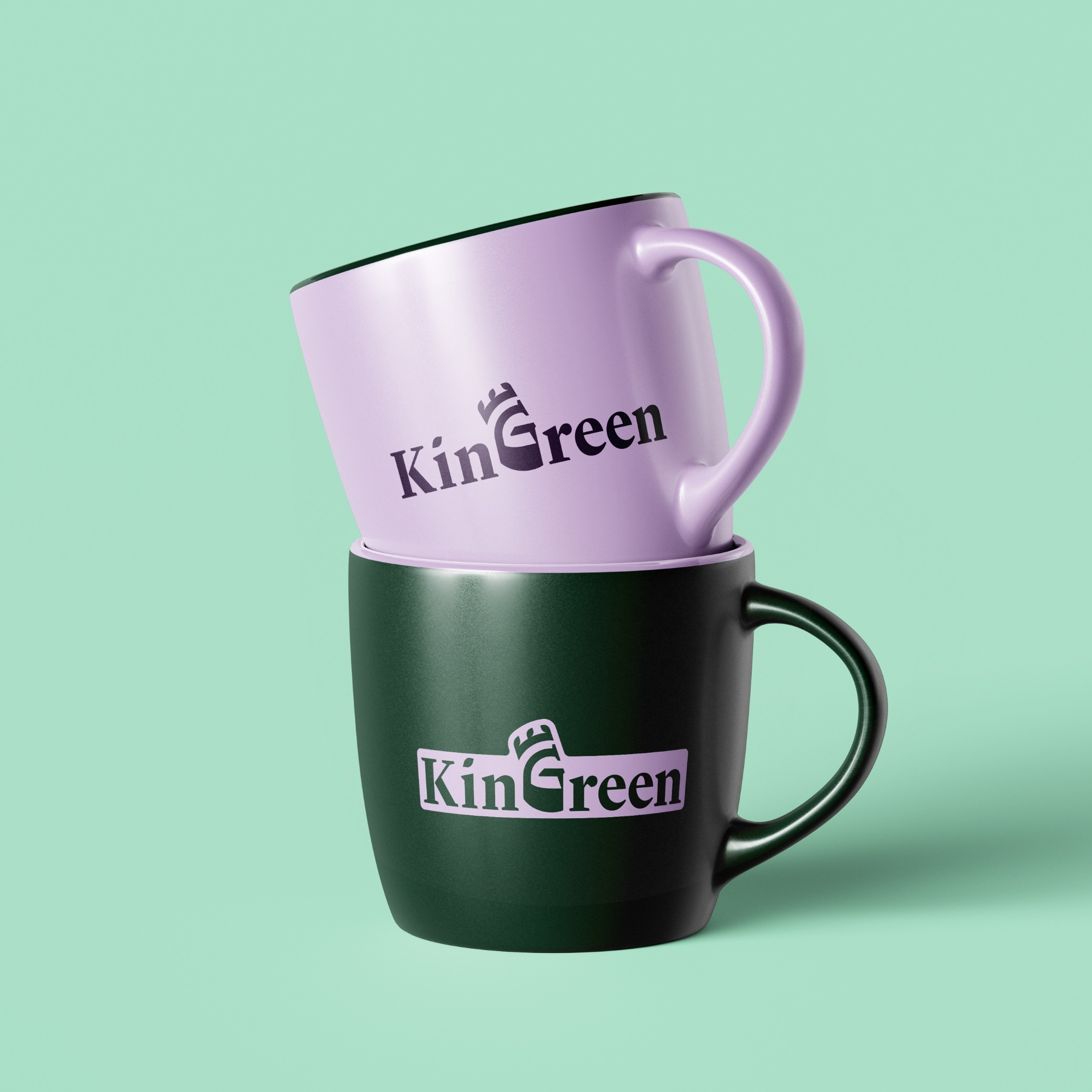
The logo became the brand’s cornerstone:
A unique G shaped as a royal silhouette, crowned with tea leaves — symbolizing power, nature, and distinction.
By anchoring the identity around a single, meaningful glyph, we helped the client own a visual space that feels completely their own — far from generic tea brands.
Result: A timeless identity that brews prestige into every detail.


